It resulted in this card:

(...hard to see the grey dots in the first pic...
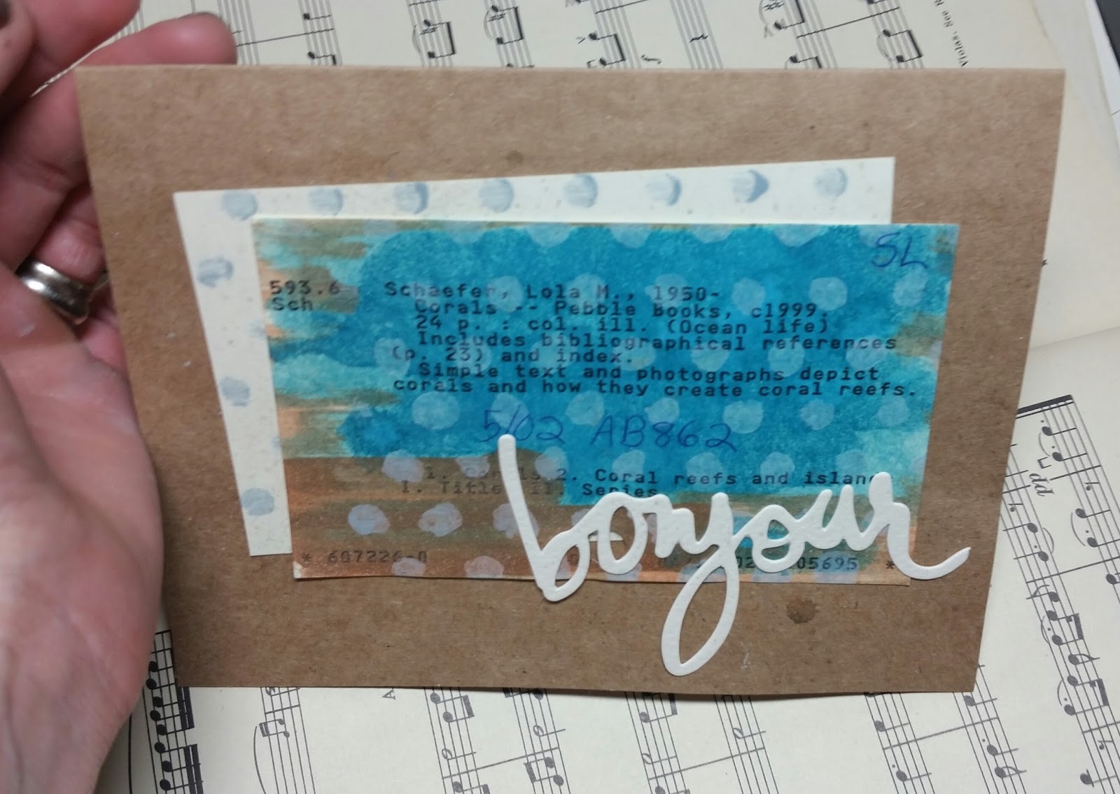
...so I bring you picture #2, which shows the dots and also shows the rusty-color from the palette...

...and now this one because it's so sexy!)
Here's that palette:

Supplies and notes:
- Started out with a library catalog card, of course, and ran Tim Holtz's Distress Stain in Beach Glass and Antique Bronze, then I sprayed and splattered with a little water...
- Then I used Tim's Distress Paint in Weathered Wood through a Martha Stewart stencil... as I was going through the process I thought, ya know, maybe shoulda used paint first and stain second... oh well. Turned out fine.
- Polka-dotted another catalog card for another layer
- Added a little Heidi Swapp "bonjour"
- Sprayed with the gold Perfect Pearl mist
Very nice design... thanks for joining us for the Color Throwdown!
ReplyDeleteI love how you created the background layers and the white sentiment diecut is the perfect detail....awesome design!!! Thanks so much for playing along with us at the Color Throwdown!!!
ReplyDelete