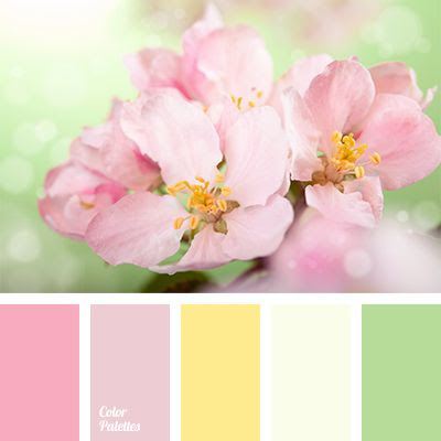
This week, we are doing something we don't do often: issuing a color challenge based on an image:
Here is my card:
 |
| Ugh... this image is so washed out! I'm sorry! The colors were truly much more bold IRL. This winter is killin' me, with regards to photography! |
Supplies:
- Strathmore watercolor paper
- Faber-Castell Pitt pens for lettering and doodled wreath... haven't been using them as much as the Microns I got for xmas, so this was a choice in using my stash!
- Spectrum Noir grey (IG4) used for shadows
- Everything was "watercolored" using Loew Cornell brushes and the following DIs selected to match the given palette: Scattered Straw, Shabby Shutters, Spun Sugar, and Victorian Velvet.
- I rounded the corners because of a boo-boo...
- Liquid Pearls added for a touch of dimension
Join me! Got stash? Link up at Shopping Our Stash, and for mo' better inspiration, go visit my DT homegirls, plus Ina!
Hello Mimi: Well, I hear you about this Winter, hate gray days.
ReplyDeleteBut your card is soft and beautiful, the little flowers and the wreath are perfect for Spring.
Love the fix of the boo boo, I wonder what happened? perhaps inky fingers?
Lovely and sweet card.
Hugs,
Maria.
ok, sooooooo i was already IN LOVE with this, and then i read your post and realized you DREW AND LETTERED the whole entire thing??!?!?!? <3 <3 <3 <3 <3 (YOWZA!!!) <3 <3 <3
ReplyDeleteOh my goodness, you drew everything AWESOME. Fabulous creativity. I know what you mean by the photography, your work is only as good as the sunlight lol.
ReplyDeleteDon't you hate it when your card doesn't photograph as nice as it is IRL. Such a lovely sweet softly coloured card. Lovely sentiment font.
ReplyDeleteI love the color on your card so softly and so sweet sentiment too you added Mimi
ReplyDeleteand I really love the color palette but I am not making flower card with soft color oooh (SAD ME) will join next week if you show SOS again and I try to join is okay Mimi?
I loved this when I first saw it, but then to find out this was completely hand drawn by you, OMG! AMAZEBALLS!! Love love love this!
ReplyDeleteYour card doesn't look washed out, but winter sure does no good for photos, I see that on my own cards. Lucky mishap, the rounded corners work with this image and design!
ReplyDelete