Friday, July 29, 2016

Watery Love...

I've had this project going for a few weeks... there is really at least a day or two between all steps!

Here it is... along with some random close-ups.  But looking at it in pictures, I can see things I want to add or change... rrr...


In my mind, I am going to display this at Sarah's bridal shower next weekend, but maybe I'll be too shy with all those people around that I don't know... but I do plan to give it to Sarah.  I think it would be cute in an ocean-themed bathroom.  Or a guest bedroom.

Supplies and notes:
  • The base is a Kaisercraft lace-up card set... been in my stash for a while.  First coated with Liquitex gesso.
  • Next, Chipped Sapphire Distress Stain dabbed to the the top end.  I spritzed with vodka to add a few droplets.
  • Pebeo sand and Liquitex glass bead texture added 
  • The letters are from an old chipboard set... the packaging is long gone, but I believe it's a common brand like DCWV or Recollections.  First, I added texture by stenciling some Teresa Collins modeling paste through a stencil made from Tim's mixed media dies.  Once dry, I coated with gesso and inked with Iced Spruce and Tarnished Brass Distress Stain.  After that, Chipped Sapphire Distress Paint was wiped (with my finger) onto parts to better show the texture of the letters.  In the end, I toook a page from Marzena's book and highlighted parts of the letters to make them stand out better-- I've noticed she does this, and though it is a simple method, it yields fantastic results!  I used gesso.  I glued the letters down with Elmer's craft bond.
  • The clothy seaweed is made from Hand Made Modern (Target brand) canvas holiday pieces.  This idea was taken Autumn's book-- I think it was she who recently used greenery for seaweed with fantastic results.  I kind of thought about it and realized I'd seen it before.  Wasn't that you, Autumn??? You're a stud. Anyway, I tried to coat it with Picket Fence Distress Crackle Paint, but I didn't have enough left :(, so I ended up just coating it with gesso (Ummm, Liquitex gesso kind of owned this project!)
  • The crystal seaweed was originally some cool aquamarine glass bead sprays, but I inked them with Adirondack Alcohol Ink in Oregano... perfect for seaweed! I curled a few of the wire ends with a dowel.
  • The sea-star was made with an old Prima flower from my stash... turned upside-down and covered with the Liquitex glass bead gel... hmmm... could definitely improve upon this, but it has potential.  I also thought maybe I'd cover it with the Pebeo sand paste, but then it would match, ahem, the sand... but I could do that and add a little rosy paint... my wheels are turnin'...
  • Seashells from my sister, who bought them to use at Sarah's bachelorette-- they never got used and I swiped them!  I plan to use them for wedding decorations somehow.  These ones got a few drops of Glossy Accents as water droplets on them.
  • Liquid Pearls were added in Rose Gold and plain white pearl
  • Aleena's glitter snow added to the top and top corners to resemble sea foam
  • The piece was laced up using some cool yarn from Tuesday morning
I'd like to share this at the following challenges:
Now, off to go watch The Little Mermaid.

Just Us Girls... doing a masculine tag...

Haven't played with JUGS in awhile...

...but I liked this graphic so much:

Supplies and notes:

  • 7 Gypsies tag painted with Liquitex gesso
  • The following DIs: Chipped Sapphire, Old Paper, Tea Dye, and Forest Moss
  • Viva Paper Pearls in Anthracite and Cream
  • Snapping Monsters grid stamp by Andrea Ockey-Parr (check out her blog and Etsy store)
  • Zig Writer to outline the card
  • Frayed Burlap DI rubbed around the edges
  • 7 Gypsies soccer guy stamp inked with Ranger Archival 
RRR... I always miss the JUGS linky!  Out of all the challenges I peruse, this is the one I constantly miss the cut-off! Ok, so, this is where Simon Says Anything Goes on Wednesday comes to the rescue!  Save me, Simon!

Wicked Wednesday

...for the first time,  I used the inspiration from Wicked Wednesday ATC Challenge to do something other than an ATC...

Here's the inspiration... a color palette!:

Supplies and notes:

  • Scrap of letterpress paper,  nearly ATC-sized
  • The inks seen in my image represent the colors from the palette
  • I blended some inks onto the paper then used a monoprint of a Heidi Swapp stencil with the darker colors for the geometric design
  • The sticker is from Collage Press. This panel will go onto a card... I'm thinking for a belated birthday. 

Wednesday, July 27, 2016

Where the magic happens...

Been so busy... no crafting time to be had in days, and even then it was minimal!  I have,  however,  been enjoying my flowers!

Here's a picture of the scrap shack and it's glorious flowers!

At this point, we need to add a few boards, add the trim, and add a step to the exterior.
Inside still needs drywall and insulation.  All of this is on the back-burner while we are
re-roofing the house. 

This is where the magic happens... 


Tuesday, July 26, 2016

Shopping Our Sewing Stash!

SEW WHAT?!

This week at Shopping Our Stash, Chris has the following challenge for you:

Challenge 262 : A Stitch In Time... 
Use stitching on your project! So bust out your 
neglected sewing machine, cross stitching skills, 
faux stitching, etc., and joiun us!

I want to say I am so glad to be part of this awesome team!  These projects continue to help me use what I have on hand, and bust out techniques that I don't normally use.  Thank you, players, for joining us!  And if you never have (you know who you are-- wink-wink!), maybe it's time... 

Just a lil' stitchery from me:
I made, basically, a notecard book!

Check that fabulous texture!

How about those cool stamps?  And do you see the inky binder ring? :)

Supplies and notes:

  • The cover of this library-card notebook was another card resulting from a playtime.  It had a layer of Teresa Collins modeling paste through a Martha Stewart heart stencil off to the side, and a spritz or two of Lemon Zest Dylusions spray when I came across it...
  • First, a thin  layer of Distress Collage Medium, Crazing was roughly spread over the card with an old hotel room key.  Only minimal crazing occurred, and I believe this is because the layer was too thin and because the ambient temperature was too warm.
  • Next, a few Distress Crayon colors were scribbled over the stenciled portion and rubbed in.  I also added Black Soot Distress Crayon on a few edges.
  • The stamps are all by Snapping Monsters mastermind Andrea Ockey-Parr... She released this artsy stamp set a few months back, and it has been so much fun to own!  Go check it out!   Anywho, among others, I used the one stamp I had from the set that had not seen ink yet-- this is because it was hiding when I mounted the rubber to the foam, and so this little guy ("Paint goes here") had remained bright red... until now!  I inked all of them for this project with Tim's Mixed Media palette, using Hickory Smoke and Black Soot.
  • And now for the sewing element: I just busted out my neglected sewing machine.  I also thought, "Okay: I'm supposed to be 'shopping my stash'..." (thus validating my extreme laziness) and used the thread that was already on the machine-- pale green with white on the bobbin.  I stitched black and white flowers (Tim's Tattered Florals) from my stash of unused diecuts, and also did a run around the edge. Ta-da!
  • For the binder-ring, I inked it with colorful alcohol inks and tied twine and cute yarn around it. 
What do you think?  Go ahead-- be lazy: use the thread that's already on your machine, or better yet: thread that's already on a needle in your sewing kit!  Or... draw your stitches!  

See you over there!

Wednesday, July 20, 2016

Tim's July Challenge, etc.

So, as my title suggests, this project was an attempt at Tim's Tag of July, 2016:

Image with gratuitous texture!
What a difference lighting makes...
The panel up to the addition of Frayed Burlap DI
Extreme close-up showing my imperfect sealing...
This just looked so pretty with the sunlight on it... had to take a pic...
Ewwww... unforgiving lighting!  Sloppy sealing!

Here are his graphics of the July remix:


Well, so I took a couple roads less traveled, but tried to get the overall "feel" of what Tim had done.

Supplies and notes:

The watercolor resist technique:
  • Started with a panel of watercolor paper and inked an Invoke Arts stamp with Archival
  • Painted the Invoke image with various DIs on the craft sheet, including Aged Mahogany, Pine Needles, Forest Moss, Tea Dye... I also added splashes of Tarnished Brass and Antique Bronze Distress Stains for the crowns
  • In order to seal, I used Distress Collage Medium in Matte... totally imperfect...
  • Heat-dried and then sprayed with Distress Stain in Pumice Stone.  Oh man: it totally bled under my sealed image and I was worried... but then I hit it with the heat tool and it settled down... thankfully...
  • Next, I went around the edges of the panel with Frayed Burlap DI and sprinkled a little water for some visual interest
  • Also added some speckles per Tim's suggestion with an old metallic marker.  Very subtle, but I like it.
The layered text technique... well, actually kind of... not reallly... I have one word die, and it's "joy"... didn't fit the project:
  • Sooo... for the background "word layer" I used Tim's Mixed Media thinlit that I thought would fit the best.  I cut into some centurian music paper and folded it around the watercolor panel, then affixed it on the backside with 7 Gypsies masking tape.
  • Because I liked the look of Tim's technique, I kind of did my own thing to achieve it by writing "love" with a Pebeo Relief Outliner
Additional notes:
  • The knocked out pieces of the lattice die became butterflies, adhered with Glossy Accents
  • Stickles in Black Diamond are the butterfly bodies and a casually-drawn border
  • The hanging apparatus is True Hemp metallic twine
  • I also added some Pebeo Relief Outliner in clear glitter to the mermaid wings
I'd also like to share this at Simon Says Stamp on Wednesday: Things With Wings.  The mermaids have wings, and so do the butterflies.  At one point the entire tag had wings but I didn't like them... I think I might make wings I like for it in the future... for now, the card itself does not fly!

Tuesday, July 19, 2016

SOS! Make a matchbox!

YAY!  My creative wheels were SOOOO turning for the current challenge at Shopping Our Stash!

We are asking you, dear, crafters, to
MAKE YOUR OWN MATCHBOOK!

Seriously, go on Pinterest (or anywhere that you get crafty inspration) and search "matchbook card" or anything like that... some people do some COOL stuff!!!  And, of course, you will find lots of inspiration by the girlies on the SOS Design Team!

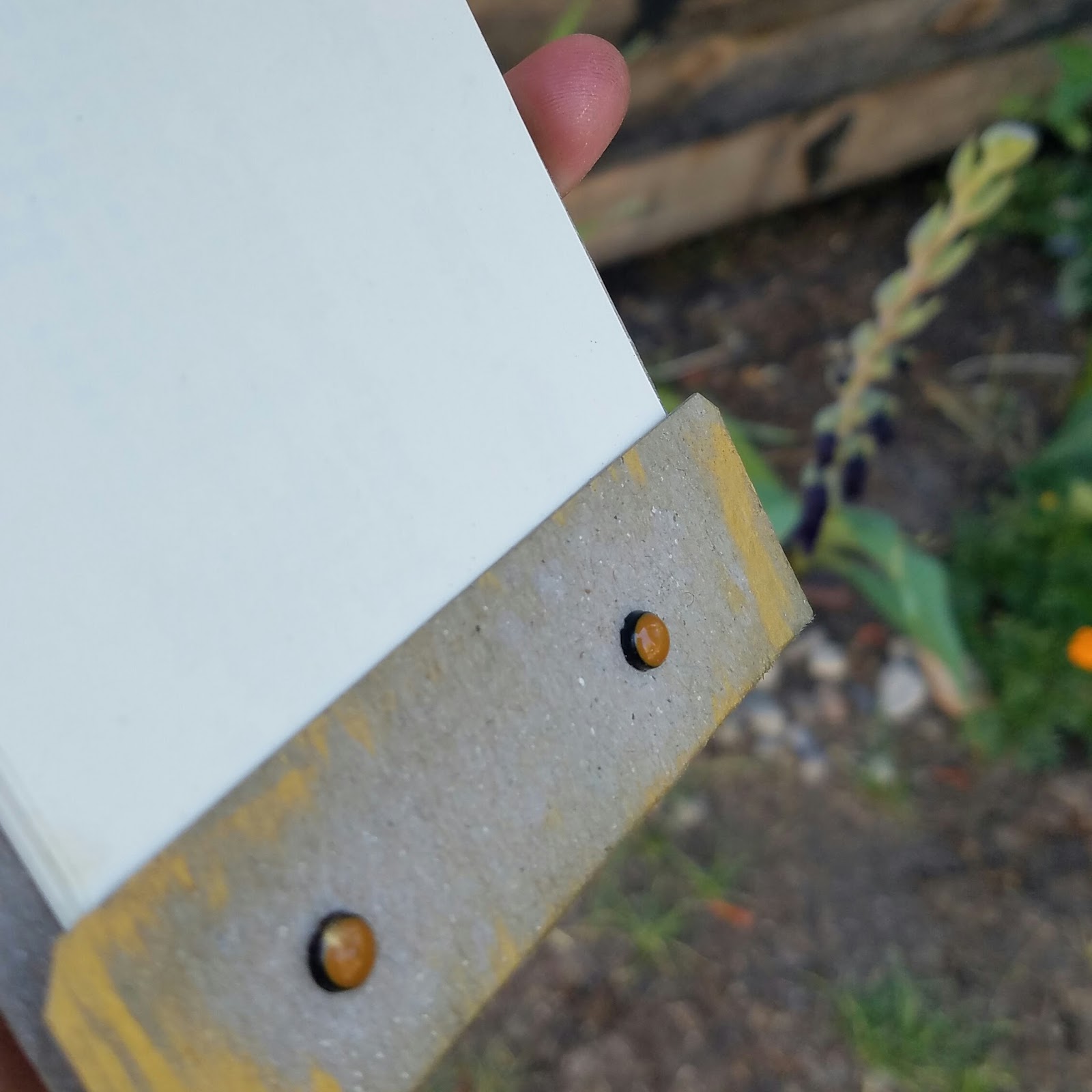
Here's what yours truly came up with... it's a notepad made from old library catalog cards:


Don't mind my hands... helped the husband with the roofing... but notice the shine... ooooh....
See the cute snipped corners?
I added the perforated edge to the library catalog cards for ease of removing.


Supplies and notes:
  • The base is made from heavy kraft used in shipping textbooks-- I have collected and hoarded bunches of it, knowing I could use it somehow
  • The text is from a Nancy Drew mystery that I've been using since the last school year... it was missing pages and therefore facing the trash or recycling bin when I "rescued" it.  I adhered it with matte Mod Podge (6 months old) and then filed the edges with an old nail file (2 years old)
  • The colored brads at the bottom have been in my stash for years-- no idea the make... 7 Gypsies maybe.  They are in holes made by my old Crop-O-Dile, and holding in old library cards, of which I have thousands... talk about a stash...
  • The label plate is one from the old mill yard.  My husband lovingly pried them from an old cubby in the junk heap... my guess is 50-75 years old.  Best husband ever.  It is attached to the matchbook with Recollections brads-- in stash for many, many years
  • The acetate of roses was inserted into the label plate so as not to cover that wonderful old text!  I colored the Prima acetate (from 2008) with various Ranger brands of alcohol inks in Oregano and Butterscotch.  Glossy Accents is holding it in place.
  • The pen nib is the newest item on this creation-- bought these about two months ago.  I inked it with Oregano alcohol ink to help it match the label plate better... close enough...
  • For the aging of the matchbook, I inked it with Frayed Burlap DI and spritzed it with water.  Did that twice, actually.  The kraft pretty much drank the water... so after that, I decided to get more dramatic and rubbed it down with DecoArt Metallic Lustre in Gold Rush.  Yummo.
And just so it wasn't in vain, here is my very first attempt at making a matchbook when I saw this challenge come up:
This belongs to my daughter now.  It's made from DCWV paper and ancient brads.

So, what are you waiting for??? Isn't your creative brain ON FIRE???

Have fun!  Try something you have never tried and link up at Shopping Our Stash!